Showing posts with label cover love. Show all posts

Monday, March 13, 2023

Official Cover Reveal + Contest + Read HELLFINDER for Free

The awesome and incredible HELLFINDER cover leaked several months ago and I was going to do an official reveal on Halloween, but I got busy at work. Then I was gonna do it on New Years Day, but I got busy with life, and now here we are--less than 6 months from release. And finally I have time to set up a Rafflecopter and a newsletter. Let's goooooo!

The tl;dr is that this post contains the cover, info about the book, a link where you can pre-order a gorgeous finished copy, a link where you can access an e-ARC free via NetGalley, and a Rafflecopter where you can win $20.

So first, here's the stunning cover, created by C.B. Royal:
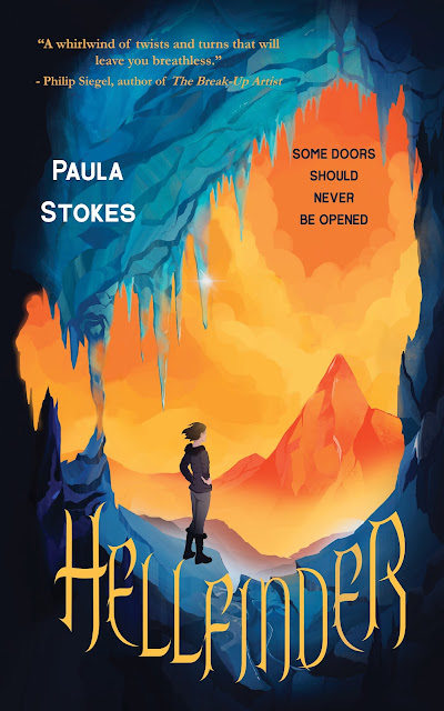
A teen girl with medium-length brown hair stands in the middle of an ice cave, looking out at at an orange and red volcano. The title text reads: HELLFINDER

I love this cover for several reasons. First, I love the overall vibe and animated feel. I think the story could make a great animated feature or graphic novel. Second, the colors. THE COLORS. I love how bright and eye-catching they are, and how they work with the story. I can definitely see how the artist incorporated in pictures of volcanoes and ice caverns I sent her. And I love that title font, even though matching it for self-designed swag is probably going to be impossible. It's malevolent, but not in an over-the-top way.

So what's the book about?

Winter Break turns deadly when Rory Quinn and her treasure-hunter grandmother travel to Iceland in search of an enchanted artifact. Their mission is to recover a blood-smeared stone that legend says will lead whoever possesses it to the nearest doorway to Hell. The client' s grandson, Einar, took the stone at the request of his favorite heavy metal band. As part of a publicity stunt, the band plans to open the closest doorway, rumored to exist deep inside one of Iceland' s many volcanoes, in just three days. 

Along with Einar' s twin brother, Gunnar, Rory and Gram will need to navigate glaciers, ice caves, and volcanic tunnels in search of the missing artifact. But can the three of them recover the stone before the band unleashes anything evil into the Icelandic wilderness? As the team grows closer to Einar, Rory is growing closer to Gunnar, too. But she can tell he' s keeping secrets from her. Big ones, that when revealed, will cause her to question almost everything she' s ever believed.

Hellfinder releases August 29, 2023.

More about HELLFINDER:

1. It's action-packed and fun! I started this book in late 2015 and finished the submission draft in early 2017, and I think it was easier for me back then to write wild and whimsical stories that aren't weighted down by grief I feel about the current state of the world. This book was inspired partly by classic adventure movies like Indiana Jones and the Temple of Doom, Romancing the Stone, and National Treasure.

2. There's an awkward and endearing PG romance. I didn't plan for a romance the same way I didn't plan these characters. Rory and Gunnar just showed up in my brain and started bickering and then bantering, and it felt right to see how their feelings developed. There's no Instalove here, but I think doing a road trip that almost kills you several times has a natural bonding effect--they're kind of like soldiers who survive combat together, but with more kissing.

3. It's grounded in reality but has supernatural elements. I'd call this urban fantasy but it takes place in tiny towns and wilderness. Rural fantasy? Is that a thing? :) I always wanted to write a story with otherworldly creatures, but I came up in the YA world right at the time every editor was buried in sexy vampires and werewolves, so my agent was always like "Ahahaha, absolutely not." But eventually it felt like it was time for another round of all-things-paranormal so I wrote it anyway. And if you like books by Kami Garcia, Cassandra Clare and Kiersten White, or shows like Lucifer, Supernatural, and The Chilling Adventures of Sabrina, then Hellfinder should be for you.

4. ICELAND! If you know me or follow me online at all you know I LOVE Iceland. I would move there tomorrow if they'd let me--honestly, even without a job. I'd figure something out. Iceland feels like another planet to me, a kinder, more compassionate one, albeit with a rockier and less-forgiving topography. If you enjoy the idea of standing beneath majestic waterfalls, hiking on glaciers, dogsledding, swimming in geothermal pools, and/or crawling through ice caves and lava tubes, this book will deliver the sensory goods. Seriously, if you've read this far and don't want to check out the book, then you should skip it, but consider a trip to Iceland someday if it's within your means. It really is a magical life-changing kind of place.


Interested in pre-ordering? 

I will be setting up a pre-order giveaway after I get some stickers and bookplates made, but you can pre-order now and still qualify for that. Just follow me on social or subscribe to my mailing list so you won't miss the announcement. You can find this title in the usual places, but if you want to support an all-female run small business, pre-order direct from Regal House/Fitzroy.


How do I read for free?

HELLFINDER is on NetGalley right now, available to everyone with an account! Writing for a small publisher means there's not always money available for promo like NetGalley, so I paid my own money to get the book listed because I think word-of-mouth is one of the best ways to promote artistic work. I want lots of people to be able to read the novel, especially those without a lot of money to spend on physical copies and folks who live in countries where they might not be able to find HELLFINDER at a bookstore or library. If you're a new reviewer who gets rejected by the bigger publishers, rest assured HELLFINDER is available to everyone. If you have trouble accessing it, email me at pstokesbooks [at] gmail [dot] com and let me know. I'll do my best to get you sorted.
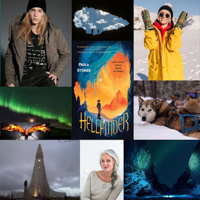
A mood board collage featuring images of a young guy in a knit hat with long blonde hair, a smiling teen girl in outerwear surrounded by snow, a mysterious-looking older woman with a gray braid, a gray church with a tall steeple, brilliant green Northern Lights, a man with flaming wings, an ice cave, and a team of sled dogs. The HELLFINDER cover, featuring a girl looking at a fiery volcano, is in the center.

Last but not least, the contest:

I wanna do whatever I can to get the word out about the book and e-galley, so I cooked up a little Rafflecopter with that in mind. Winner gets a $20 gift card to Barnes and Noble, Amazon, Etsy, or another retailer/restaurant of your choice. International folks are welcome, but I may have to limit the gift card selections. If nothing else I will order you a book from The Book Depository or PayPal you $20 USD. Contest ends March 31st.


a Rafflecopter giveaway


Friday, November 6, 2015

Cover Love, Part II: GIRL AGAINST THE UNIVERSE

Last month I did a post about the VICARIOUS cover. Now I'm going to talk about how much I love the cover for GIRL AGAINST THE UNIVERSE. Bonus, I'm also going to link to a contest for the first signed ARC and tell you how you can enter to win the second signed ARC. These are the only ARCs I'll be signing and giving away this year, so if you want to read a printed version of the story early, this is the post for you.

Most book covers are either photography-based or art-based, and both methods can be created in a variety of ways. I don't know much about graphic design, so here's where I stop pretending ;) The cover for GATU is art-based (Illustrated? Someone correct me if I'm using terminology wrong), which means there are no photo shoot stills to share this time. But here's the pretty, pretty cover in jumbo size :D


I did get a couple of cover composition drafts before this, but I didn't ask for permission to share those because they were basically just looser sketches of the final product and that would be like asking to post someone's rough draft. Instead I'm going to show my love for this GATU cover with a Top Ten List:

Paula's Top Ten Favorite Things About the GATU Cover


#10: The title. I was sort of whiny sad when my editor emailed to say that she and her boss thought the original title, Bad Luck Charm, was skewing a little too middle-grade and did I have some alternate suggestions. I had anchored that title into the first chapter and the last chapter. I had been working with it for about a year. I was kind of attached to it, even though I agreed it was a bit fluffy for the book. It just seemed so much catchier than anything else I could think of!

Eventually I sent my editor a whole slew of potential titles and everyone on the team liked Girl Against the Universe. Some of the rejected suggestions include: The Curse Effect, They Call Me Miss Fortune, Semi-charmed Life, and The Day I Tried to Live. (Sorry, Third Eye Blind. Sorry Soundgarden. Maybe next time ;D) It's funny, though. We officially changed the title in early April and since then I've grown really attached to it.

#9: The tennis court. I'm a big believer in covers as contracts between authors and readers. When a cover is all dark and scary and screaming MURDER DEATH KILL (points if you know the movie reference) and the book turns out to be a foofy love story, that makes me reader-me kind of cranky. Authors don't have ultimate control over their book covers, but I would never want to directly mislead readers. So yeah, there is a LOT of tennis in this story. This book might even improve your serve ;)

#8: The color. At first I was like "Orange? But will people think it's a clay court?" (I can be kind of "inside the box" sometimes, like so far inside I'm trapped and I can't get out.)


But then I realized tennis courts can be any color, and that orange is waaaay more eye-catching than the blue or green courts I played on in high school. Fun fact: I wrote an orange tennis court into the book after I saw this awesome cover :)

#7: The background effect. I don't know what this is called, but I love that it isn't just a flat even orange color, like paint. The different shades of orange and swirls of light and dark really make this pop. It's one of those things that makes me go "How did someone even think to do that??"

#6: The tiny but meaningful details. The shoes. The sweatbands. The perfect scattering of tennis balls. Nothing on this cover is trivial. It all adds up to perfect.

#5: The little heart that Maguire has drawn in her luck notebook. She might think she is all business, recording the bad things that happen and doing her five-second checks to make sure danger isn't lurking nearby, but she's not immune to being distracted.


#4: The dreamy and pensive overall feel of this image. Orange could be a really in-your-face color, but it's not overpowering here. The fact that this cover has a lot of open space and that the figure of Maguire is sort of undefined I think helps too. Again, the summation of a lot of separate smaller things add up to magic!

#3: The stylized artwork. I like that you only get a vague idea of what Maguire looks like. It's all exactly how I imagined her, from the hair to the skin tone to the body shape, but she's drawn in a way that still lets the reader fill in her details.

#2: Her realistic figure. We all know there's a tendency to idealize cover images, whether it's Photoshopping an already stunning supermodel or drawing a storybook princess with proportions incompatible with life. I love that Maguire has hips and boobs and thighs. I remember one of my first thoughts when I saw this was: Her leg is quite a bit bigger at the top than the bottom, just like mine. I'm so grateful for this realistic rendering of my protagonist.

#1: The title font. I've been looking at this cover for almost six months and I still can't decide if I like the "Girl" or "Universe" better. And the combination of the two is another one of those "How do people know how to do that??" moments. For realz. My inside-the-box brain would have used one or the other, but the mix n' match here really makes this cover something special.

So those are a few of my favorite things. Thanks so much to the cover designer Aurora Parlagreco and artist Amir Belhoula for coming up with a cover that matches both the tone and storyline of Girl Against the Universe so perfectly! Designers and artists work hard to create covers that readers love. What do you like best about this cover?

GIVEAWAY 


You can enter the Rafflecopter giveaway and meet four of the main characters on blogs run by some of my early readers :)

Meet main character Maguire over at Forever 17 Books. (Watch out for the tiger!)

Crystal's got the basics on book-boyfriend Jordy on the Bookiemoji site

If you're into supportive besties, you'll definitely want to meet Jade on In Love With Handmade.

Meet Maguire's therapist, Dr. Leed, (or Dr. Hottie as Stacee calls him) over at Adventures of a Book Junkie.

For a second chance to win a signed ARC (INT), join my mailing list before November 9th and I'll send you details on how to enter in my next Stokes About Books newsletter. For those of you who use Edelweiss, the GATU e-arc should be available soon, but I don't have an exact date. Someone let me know when it pops up, okay?


Monday, October 5, 2015

Cover Love, Part I: VICARIOUS

Last month, the fabulous people over at YA Books Central revealed the cover for VICARIOUS, my August 2016 release. VICARIOUS is the first book in an action-thriller duology, and my first book with Tor Teen. This is a hard book to encapsulate in a single image so I was curious to see what the design team would come up with but I never in a million years expected to fall in love with their finished product the way that I did.

I LOVE LOVE LOVE this cover. I want it on canvas wall-hangings and tote bags. I want it on a T-shirt and a wrap-around dress. I kind of want someone to come paint it on my wall :) Seriously. I love it so much that I got permission to share some behind the scenes snippets of how it came to be. (Thanks to Melissa, Seth, David, and Craig for that!)

Before the design team got started, my editor Melissa asked me if I had any ideas for the cover and I sent her a whole document full of published covers I gravitated toward. Some were futuristic and minimalist. Others were more Asian or manga-inspired. I loved the idea of having my main character, Winter, on the cover because she's Korean there aren't a ton of Asian cover models in YA. I also loved the idea of possibly incorporating in the St. Louis skyline. I grew up in St. Louis and was still living there when I wrote this book. Ferguson was in the news a lot when we began talking cover design in early 2015, and it hurt to see my hometown being negatively portrayed by so many people.

My editor emailed back with a suggestion: I keep thinking about the scene with Winter on the bridge from the beginning of the book. How do you feel about something like the Catwoman movie poster?

Source: IMDB publicity poster

My initial thoughts were: Oh crap, now I'm going to envision Winter in that awkward-looking headpiece. And then, Well, I do feel like the book has kind of an action-hero/comic book vibe to it, and that would be a good way to incorporate in both Winter and the city skyline...

So I was initially a bit nervous about this idea but I have always loved the cover art from Tor and I decided to just trust in my editor and the process and see what happened. "Catwoman movie poster! Yeah, let's do it!" I said.

I didn't even know we were using images from a photo shoot until I got thirty-five proofs in my inbox and a note asking if any of them stood out to me. Going through them was so fun :D I remember emailing Melissa back like: I LIKE ALL OF THEM!!

Eventually I picked out five or six, a couple profiles, a couple front view, a couple of the model standing. Melissa and I liked most of the same shots and she sent a variety of possibilities to the design team so they would have a lot of flexibility in creating the bridge and cityscape around the model.

Here's the photo that made the cover, along with a couple other ones we liked. It's amazing to me how this model can look different in every shot. Both she and the photographer are brilliant!


Photo: David Wager

Photo: David Wager

Photo: David Wager

And then one day I got this lovely composition in my inbox:


Artist: Craig White

Both Melissa and I were like: OMG! IT IS SO BEAUTIFUL. But we both also felt like it was a little serene for the story as written, and it was hard to tell Winter was on a bridge. Plus I'm one of those super-literal types, and based on where Winter is located with respect to the city and river, that would make this sunset, which isn't exactly how it goes down in the book.

So Melissa and I suggested things like making more of a bridge if possible, and making it darker or more snowy or roughing up the river a bit. Additionally, I mentioned that when Winter jumps from the bridge there are police cars surrounding the area so maybe instead of the setting sun the artist could incorporate in red and blue lighting. [Note: As you can probably tell by my sad little Blogger website, I know nothing, NOTHING about graphic design or creating cover images. Those were just my clueless layperson suggestions.]

So those suggestions resulted in a couple other comps:


Artist: Craig White
Artist: Craig White

There are things I love about both of these comps. I love the roughed up water in the first picture but didn't like the beam across the Arch. I loved the molding in the second picture but didn't like losing the river. Most importantly, by asking for darker and snowier images, we lost a lot of the beauty and balance of the first picture. Both my editor and I quickly realized we wanted to go back to the initial composition, and the only change that was made to it was to rough up the river.

So then all that was left was figuring out the font. I'm not going to lie--my brain could not conceptualize a title going smack across Winter's body. I was really expecting a vertical title on the far right. Once again, I was wrong. Here are a couple of fonts that were ultimately not used:


Artist: Craig White

Artist: Craig White

Artist: Craig White

Holy crap! What a difference a font makes, right? Obviously the first picture is one of the alternate cover images, but just look at how different the feel of these three fonts are. My favorite of these is number three, but it was sent to me for review along with the final cover font, which both my editor and I strongly preferred over the others.


The final font is not only gritty and futuristic, it's also designed in a way that makes it striking even as a thumbnail. The finished cover feels like a movie poster to me, which is perfect given the cinematic structure and prose of this book.

It's hard for me to choose what I like best about this image--the ideal model for my main character, the fonts, the tilted horizon, the dark and light sky, the snow, the sun as a metaphor for a bit of hope in a very dark story--all of it works so well to me. I am very grateful to everyone involved in the creation of this cover.

Next month I'll be blogging about the GIRL AGAINST THE UNIVERSE cover, which is also amazing and a great fit for the story. In the meantime, what do you think of the VICARIOUS cover? What are some other covers that you think fit perfectly with their books?