I LOVE LOVE LOVE this cover. I want it on canvas wall-hangings and tote bags. I want it on a T-shirt and a wrap-around dress. I kind of want someone to come paint it on my wall :) Seriously. I love it so much that I got permission to share some behind the scenes snippets of how it came to be. (Thanks to Melissa, Seth, David, and Craig for that!)
Before the design team got started, my editor Melissa asked me if I had any ideas for the cover and I sent her a whole document full of published covers I gravitated toward. Some were futuristic and minimalist. Others were more Asian or manga-inspired. I loved the idea of having my main character, Winter, on the cover because she's Korean there aren't a ton of Asian cover models in YA. I also loved the idea of possibly incorporating in the St. Louis skyline. I grew up in St. Louis and was still living there when I wrote this book. Ferguson was in the news a lot when we began talking cover design in early 2015, and it hurt to see my hometown being negatively portrayed by so many people.
My editor emailed back with a suggestion: I keep thinking about the scene with Winter on the bridge from the beginning of the book. How do you feel about something like the Catwoman movie poster?
 |
| Source: IMDB publicity poster |
My initial thoughts were: Oh crap, now I'm going to envision Winter in that awkward-looking headpiece. And then, Well, I do feel like the book has kind of an action-hero/comic book vibe to it, and that would be a good way to incorporate in both Winter and the city skyline...
So I was initially a bit nervous about this idea but I have always loved the cover art from Tor and I decided to just trust in my editor and the process and see what happened. "Catwoman movie poster! Yeah, let's do it!" I said.
I didn't even know we were using images from a photo shoot until I got thirty-five proofs in my inbox and a note asking if any of them stood out to me. Going through them was so fun :D I remember emailing Melissa back like: I LIKE ALL OF THEM!!
Eventually I picked out five or six, a couple profiles, a couple front view, a couple of the model standing. Melissa and I liked most of the same shots and she sent a variety of possibilities to the design team so they would have a lot of flexibility in creating the bridge and cityscape around the model.
Here's the photo that made the cover, along with a couple other ones we liked. It's amazing to me how this model can look different in every shot. Both she and the photographer are brilliant!
 |
| Photo: David Wager |
 |
| Photo: David Wager |
 |
| Photo: David Wager |
And then one day I got this lovely composition in my inbox:
 |
| Artist: Craig White |
Both Melissa and I were like: OMG! IT IS SO BEAUTIFUL. But we both also felt like it was a little serene for the story as written, and it was hard to tell Winter was on a bridge. Plus I'm one of those super-literal types, and based on where Winter is located with respect to the city and river, that would make this sunset, which isn't exactly how it goes down in the book.
So Melissa and I suggested things like making more of a bridge if possible, and making it darker or more snowy or roughing up the river a bit. Additionally, I mentioned that when Winter jumps from the bridge there are police cars surrounding the area so maybe instead of the setting sun the artist could incorporate in red and blue lighting. [Note: As you can probably tell by my sad little Blogger website, I know nothing, NOTHING about graphic design or creating cover images. Those were just my clueless layperson suggestions.]
So those suggestions resulted in a couple other comps:
 |
| Artist: Craig White |
 |
| Artist: Craig White |
There are things I love about both of these comps. I love the roughed up water in the first picture but didn't like the beam across the Arch. I loved the molding in the second picture but didn't like losing the river. Most importantly, by asking for darker and snowier images, we lost a lot of the beauty and balance of the first picture. Both my editor and I quickly realized we wanted to go back to the initial composition, and the only change that was made to it was to rough up the river.
So then all that was left was figuring out the font. I'm not going to lie--my brain could not conceptualize a title going smack across Winter's body. I was really expecting a vertical title on the far right. Once again, I was wrong. Here are a couple of fonts that were ultimately not used:
 |
| Artist: Craig White |
 |
| Artist: Craig White |
 |
| Artist: Craig White |
Holy crap! What a difference a font makes, right? Obviously the first picture is one of the alternate cover images, but just look at how different the feel of these three fonts are. My favorite of these is number three, but it was sent to me for review along with the final cover font, which both my editor and I strongly preferred over the others.

The final font is not only gritty and futuristic, it's also designed in a way that makes it striking even as a thumbnail. The finished cover feels like a movie poster to me, which is perfect given the cinematic structure and prose of this book.
It's hard for me to choose what I like best about this image--the ideal model for my main character, the fonts, the tilted horizon, the dark and light sky, the snow, the sun as a metaphor for a bit of hope in a very dark story--all of it works so well to me. I am very grateful to everyone involved in the creation of this cover.
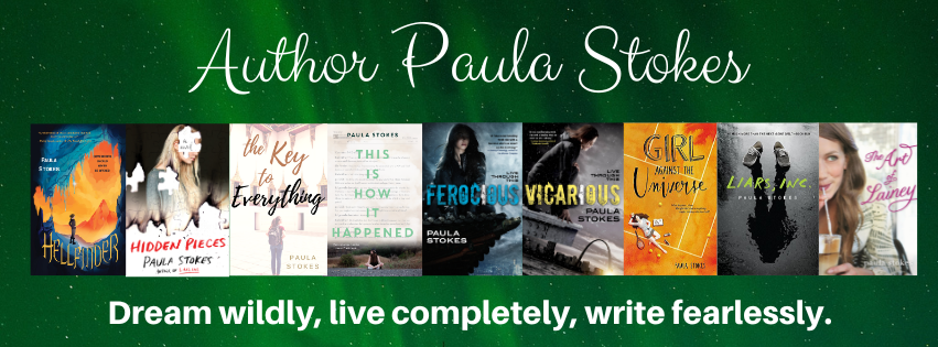
Next month I'll be blogging about the GIRL AGAINST THE UNIVERSE cover, which is also amazing and a great fit for the story. In the meantime, what do you think of the VICARIOUS cover? What are some other covers that you think fit perfectly with their books?