Monday, November 23, 2015

#BlackFridayDeals: Liars, Inc. $1.99 Sale and Manuscript Critique Giveaway!

It's that time of year again...


So REI is recommending that people #OptOutside this Black Friday. I don't know where they are based, but I suspect it's someplace warmer than where most of us live. Therefore I am recommending an alternate #OptInside idea, one that involves hot cocoa and kitties and books, and does not involve getting jabbed in the kidney by an elderly man with a cane who probably needs that 62 inch flat screen more than you do.

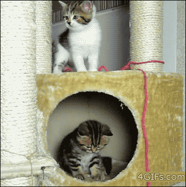
This #BlackFriday, why not curl up with a kitty (okay, a dog is also acceptable), a mug of delicious cocoa (okay, tea is also acceptable), and a copy of Liars, Inc. for the low, low price of $1.99? (Sorry, no other books are acceptable. Hehehe, just kidding :D)


But seriously, HarperTeen has discounted the e-book at Amazon, Amazon-Canada (#YayCanada!), B&N and iTunes. Here's a link where you can read the beginning if you're a try before you buy kind of person :) Maybe check out some of the fun extras while you're there.

But maybe you don't want to read Liars, Inc. because you hate mysteries or slacker boy narrators or you've already read it or you're planning to focus on powering through the rest of your #NaNoWriMo manuscript. I don't officially do NaNo (though I unofficially do it about once a year when I get behind on deadlines >_>), but I am totally in awe of you guys that can maintain that laserlike focus for more than 2 minutes  an entire month.

So I thought in the spirit of awesome deals that I would give away three 10-page critiques (valued at $30.00 each) in exchange for supporting Liars, Inc. You don't have to be a NaNo participant to enter this contest, but the three winners will be required to submit the first 10 pages of their WIP or finished work in standard 12-point font, double-spaced format between December 1, 2015 and June 30, 2016. (This window is just because I am kind of a giveaway machine sometimes and I can't leave stuff too open-ended or I lose track of it.) My published books are all YA, but I have edited MG, NA, and adult, and feel comfortable working with stories in these categories. Winners must be 13+ or have a parent's permission.


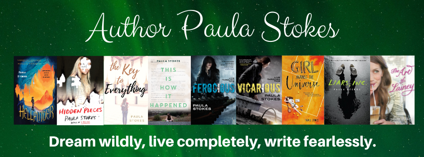
And why would you want a critique from me? Well, you can read my shamelessly braggy editor bio on the Manuscript Critique Services site, but the short version is that I've got 5 books out and another 5 on the way, I've worked with editors at Penguin Teen, Paper Lantern Lit, HarperTeen, and Tor Teen, and most importantly, I LOVE to crit manuscripts and query letters. Not just because I like the challenge of analyzing a manuscript or query letter and deciding what is and isn't working, but also because helping other writers helps me grow as a writer myself. Here's a quote from one of my recent clients:

"Paula's thorough, personalized, incisive, thought-provoking feedback is precisely what I needed to make my work agent-ready. I highly recommend MCS. Consider it a shrewd career investment!"

And just to be clear, if you win a free critique, there is no obligation to purchase additional editing, there's no obligation to respond to my crit notes (though I welcome comments and questions), and you will never hear from me again unless you contact me. Sound good? Check out the Rafflecopter below and tell me in the comments what you're really going to do on #BlackFriday :)


a Rafflecopter giveaway

Friday, November 6, 2015

Cover Love, Part II: GIRL AGAINST THE UNIVERSE

Last month I did a post about the VICARIOUS cover. Now I'm going to talk about how much I love the cover for GIRL AGAINST THE UNIVERSE. Bonus, I'm also going to link to a contest for the first signed ARC and tell you how you can enter to win the second signed ARC. These are the only ARCs I'll be signing and giving away this year, so if you want to read a printed version of the story early, this is the post for you.

Most book covers are either photography-based or art-based, and both methods can be created in a variety of ways. I don't know much about graphic design, so here's where I stop pretending ;) The cover for GATU is art-based (Illustrated? Someone correct me if I'm using terminology wrong), which means there are no photo shoot stills to share this time. But here's the pretty, pretty cover in jumbo size :D


I did get a couple of cover composition drafts before this, but I didn't ask for permission to share those because they were basically just looser sketches of the final product and that would be like asking to post someone's rough draft. Instead I'm going to show my love for this GATU cover with a Top Ten List:

Paula's Top Ten Favorite Things About the GATU Cover


#10: The title. I was sort of whiny sad when my editor emailed to say that she and her boss thought the original title, Bad Luck Charm, was skewing a little too middle-grade and did I have some alternate suggestions. I had anchored that title into the first chapter and the last chapter. I had been working with it for about a year. I was kind of attached to it, even though I agreed it was a bit fluffy for the book. It just seemed so much catchier than anything else I could think of!

Eventually I sent my editor a whole slew of potential titles and everyone on the team liked Girl Against the Universe. Some of the rejected suggestions include: The Curse Effect, They Call Me Miss Fortune, Semi-charmed Life, and The Day I Tried to Live. (Sorry, Third Eye Blind. Sorry Soundgarden. Maybe next time ;D) It's funny, though. We officially changed the title in early April and since then I've grown really attached to it.

#9: The tennis court. I'm a big believer in covers as contracts between authors and readers. When a cover is all dark and scary and screaming MURDER DEATH KILL (points if you know the movie reference) and the book turns out to be a foofy love story, that makes me reader-me kind of cranky. Authors don't have ultimate control over their book covers, but I would never want to directly mislead readers. So yeah, there is a LOT of tennis in this story. This book might even improve your serve ;)

#8: The color. At first I was like "Orange? But will people think it's a clay court?" (I can be kind of "inside the box" sometimes, like so far inside I'm trapped and I can't get out.)


But then I realized tennis courts can be any color, and that orange is waaaay more eye-catching than the blue or green courts I played on in high school. Fun fact: I wrote an orange tennis court into the book after I saw this awesome cover :)

#7: The background effect. I don't know what this is called, but I love that it isn't just a flat even orange color, like paint. The different shades of orange and swirls of light and dark really make this pop. It's one of those things that makes me go "How did someone even think to do that??"

#6: The tiny but meaningful details. The shoes. The sweatbands. The perfect scattering of tennis balls. Nothing on this cover is trivial. It all adds up to perfect.

#5: The little heart that Maguire has drawn in her luck notebook. She might think she is all business, recording the bad things that happen and doing her five-second checks to make sure danger isn't lurking nearby, but she's not immune to being distracted.


#4: The dreamy and pensive overall feel of this image. Orange could be a really in-your-face color, but it's not overpowering here. The fact that this cover has a lot of open space and that the figure of Maguire is sort of undefined I think helps too. Again, the summation of a lot of separate smaller things add up to magic!

#3: The stylized artwork. I like that you only get a vague idea of what Maguire looks like. It's all exactly how I imagined her, from the hair to the skin tone to the body shape, but she's drawn in a way that still lets the reader fill in her details.

#2: Her realistic figure. We all know there's a tendency to idealize cover images, whether it's Photoshopping an already stunning supermodel or drawing a storybook princess with proportions incompatible with life. I love that Maguire has hips and boobs and thighs. I remember one of my first thoughts when I saw this was: Her leg is quite a bit bigger at the top than the bottom, just like mine. I'm so grateful for this realistic rendering of my protagonist.

#1: The title font. I've been looking at this cover for almost six months and I still can't decide if I like the "Girl" or "Universe" better. And the combination of the two is another one of those "How do people know how to do that??" moments. For realz. My inside-the-box brain would have used one or the other, but the mix n' match here really makes this cover something special.

So those are a few of my favorite things. Thanks so much to the cover designer Aurora Parlagreco and artist Amir Belhoula for coming up with a cover that matches both the tone and storyline of Girl Against the Universe so perfectly! Designers and artists work hard to create covers that readers love. What do you like best about this cover?

GIVEAWAY 


You can enter the Rafflecopter giveaway and meet four of the main characters on blogs run by some of my early readers :)

Meet main character Maguire over at Forever 17 Books. (Watch out for the tiger!)

Crystal's got the basics on book-boyfriend Jordy on the Bookiemoji site

If you're into supportive besties, you'll definitely want to meet Jade on In Love With Handmade.

Meet Maguire's therapist, Dr. Leed, (or Dr. Hottie as Stacee calls him) over at Adventures of a Book Junkie.

For a second chance to win a signed ARC (INT), join my mailing list before November 9th and I'll send you details on how to enter in my next Stokes About Books newsletter. For those of you who use Edelweiss, the GATU e-arc should be available soon, but I don't have an exact date. Someone let me know when it pops up, okay?