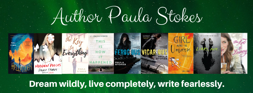
Most book covers are either photography-based or art-based, and both methods can be created in a variety of ways. I don't know much about graphic design, so here's where I stop pretending ;) The cover for GATU is art-based (Illustrated? Someone correct me if I'm using terminology wrong), which means there are no photo shoot stills to share this time. But here's the pretty, pretty cover in jumbo size :D

I did get a couple of cover composition drafts before this, but I didn't ask for permission to share those because they were basically just looser sketches of the final product and that would be like asking to post someone's rough draft. Instead I'm going to show my love for this GATU cover with a Top Ten List:
Paula's Top Ten Favorite Things About the GATU Cover
#10: The title. I was sort of
Eventually I sent my editor a whole slew of potential titles and everyone on the team liked Girl Against the Universe. Some of the rejected suggestions include: The Curse Effect, They Call Me Miss Fortune, Semi-charmed Life, and The Day I Tried to Live. (Sorry, Third Eye Blind. Sorry Soundgarden. Maybe next time ;D) It's funny, though. We officially changed the title in early April and since then I've grown really attached to it.
#9: The tennis court. I'm a big believer in covers as contracts between authors and readers. When a cover is all dark and scary and screaming MURDER DEATH KILL (points if you know the movie reference) and the book turns out to be a foofy love story, that makes me reader-me kind of cranky. Authors don't have ultimate control over their book covers, but I would never want to directly mislead readers. So yeah, there is a LOT of tennis in this story. This book might even improve your serve ;)
#8: The color. At first I was like "Orange? But will people think it's a clay court?" (I can be kind of "inside the box" sometimes, like so far inside I'm trapped and I can't get out.)
But then I realized tennis courts can be any color, and that orange is waaaay more eye-catching than the blue or green courts I played on in high school. Fun fact: I wrote an orange tennis court into the book after I saw this awesome cover :)
#7: The background effect. I don't know what this is called, but I love that it isn't just a flat even orange color, like paint. The different shades of orange and swirls of light and dark really make this pop. It's one of those things that makes me go "How did someone even think to do that??"
#6: The tiny but meaningful details. The shoes. The sweatbands. The perfect scattering of tennis balls. Nothing on this cover is trivial. It all adds up to perfect.
#5: The little heart that Maguire has drawn in her luck notebook. She might think she is all business, recording the bad things that happen and doing her five-second checks to make sure danger isn't lurking nearby, but she's not immune to being distracted.
#4: The dreamy and pensive overall feel of this image. Orange could be a really in-your-face color, but it's not overpowering here. The fact that this cover has a lot of open space and that the figure of Maguire is sort of undefined I think helps too. Again, the summation of a lot of separate smaller things add up to magic!
#3: The stylized artwork. I like that you only get a vague idea of what Maguire looks like. It's all exactly how I imagined her, from the hair to the skin tone to the body shape, but she's drawn in a way that still lets the reader fill in her details.
#2: Her realistic figure. We all know there's a tendency to idealize cover images, whether it's Photoshopping an already stunning supermodel or drawing a storybook princess with proportions incompatible with life. I love that Maguire has hips and boobs and thighs. I remember one of my first thoughts when I saw this was: Her leg is quite a bit bigger at the top than the bottom, just like mine. I'm so grateful for this realistic rendering of my protagonist.
#1: The title font. I've been looking at this cover for almost six months and I still can't decide if I like the "Girl" or "Universe" better. And the combination of the two is another one of those "How do people know how to do that??" moments. For realz. My inside-the-box brain would have used one or the other, but the mix n' match here really makes this cover something special.
So those are a few of my favorite things. Thanks so much to the cover designer Aurora Parlagreco and artist Amir Belhoula for coming up with a cover that matches both the tone and storyline of Girl Against the Universe so perfectly! Designers and artists work hard to create covers that readers love. What do you like best about this cover?
GIVEAWAY
Meet main character Maguire over at Forever 17 Books. (Watch out for the tiger!)
Crystal's got the basics on book-boyfriend Jordy on the Bookiemoji site
If you're into supportive besties, you'll definitely want to meet Jade on In Love With Handmade.
Meet Maguire's therapist, Dr. Leed, (or Dr. Hottie as Stacee calls him) over at Adventures of a Book Junkie.
For a second chance to win a signed ARC (INT), join my mailing list before November 9th and I'll send you details on how to enter in my next Stokes About Books newsletter. For those of you who use Edelweiss, the GATU e-arc should be available soon, but I don't have an exact date. Someone let me know when it pops up, okay?
I love the cover so much! It has such a different feel from your previous books, but it might be my favorite (don't tell Vicarious).
ReplyDeleteOrange usually isn't my color, but the warm tone works really well here and the book will definitely stand out on the shelves next to all the red, blue, green and black. Hooray for a book character who plays tennis! Do you play?
I could stare at this all day. Thank you for sharing about the cover! Can't wait to read this!
Vicarious! I owe you an ARC. I'll be mailing them probably next week but I'll reach out to verify your address first :) I have gotten so lucky with covers. I absolutely adore both 2016 designs, though they couldn't be more different. This one really is soothing. It makes me less stressed just looking at it.
DeleteOrange is not a fave cover but I simply adore this cover!! It will look absolutely perfect in my Paula Stokes shelf for suuuuure!!
ReplyDeleteI love all the details and I love that it's illustrated but doesn't look childish! And even if I loved Bad Luck Charm as a title LOADS, I kinda love GATU even more now!
I feel like I should make an Orange is the New Black joke ;) And you know what? I'm totally attached to the new title now too! Once again, my editor was right and I was...not right. Though now I have to come up with a new title for my memoirs ;D
DeleteI love the font and the overall feel of this cover! The orange really makes the cover stand out~ I just tried to zoom in on Maguire's notebook but no luck. Can't tell what she's reading....heehee~ Oh and hilarious kitten gif LOL!
ReplyDeleteI totally looooove the orange. I just bought orange pens for signing books! Oh, and she's making a list. You'll find out when you read it ;)
DeleteI am only just beginning to find GIFs, but yeah that poor kitten is perfect for "distracted."
Even though I normally don't like orange, it really looks and works wonderful on this cover, I totally love it! It really catches you eye because it's so BRIGHT! I love that you get so many beautiful versions of orange/yellow/red in one picture, it gives me a bit of a watercolor feeling? It blends perfectly. I can't wait to have this on my shelves next to Liars INC. I bet the green of that spine will look AMAZING next to this orange!
ReplyDeleteYes! A watercolor feeling! And I am also looking forward to the seeing the green spine of LIARS next to this orange :)
DeleteWhat I love the most about the book's cover is the font used for the title! I really have a thing for doodly-typography-esque writings. And #7, I've been trying to figure out what those things are called, the closest thing I could get to is watercolor gradient, but anyways, I love it!
ReplyDeleteWatercolor gradient...sounds about right to me :) It actually does make it look like a clay court, kind of, because those change color in places due to the scuffing of shoes and balls, but that's okay :)
DeleteI love the detail in this cover - from the artwork down to the font. It's eye-catching! I think the shoes are my favorite detail on the cover.
ReplyDeleteI looove those cute little shoes too :)
DeleteWhen I saw this cover on Epic reads I was socompletly captivated by it! It definitely stood out from the pink and purple book covers! I love everything about this cover the tennis court ( I'm a tennis player) the orange, the font. I honestly need this made into a poster so I can put up on my wall and stare at it all day long! I first heard about Girl Against the Universe when I won a Liars Inc. Twitter giveaway and I was sent a list of your upcoming releases. I have been so excited for the book since then! I ca't believe that I only have to wait till May to get my hands on it :D
ReplyDeleteHa! I'm so glad some people read those book lists I send out :D And who knows, maybe you'll win a copy before May!
DeleteI can't wait to read this!
ReplyDeleteThe cover is definitely eye-catching! I love orange! I love that I can already tell what the book is going to be about just from the title and cover alone. (I've seen the cover first, actually, before I read the synopsis.) I like the handwritten font, though I wish they tried to make the title pop out a little more. I don't know, maybe add a text shadow or something. Nonetheless, overall it's still aesthetically pleasing!
You couldn't have picked a more perfect date to release GATU, my birthday's on the 16th of May and I will definitely add this to my birthday haul!
I also love that the combo of title, cover, and synopsis really cover the tone and storyline of the book. And yay for an almost birthday release!
DeleteI like this cover. Orange is one of my favorite colors and it isn't used very often. I also like the use of more than one font. Best of all, I think the cover layout suggests that the book has its fair share of drama but is not without a little humor.
ReplyDeleteYES! Drama + humor + romance +thoughtfulness :) The romance comes through more in the synopsis than the image, but I love the dreamy feel of this cover.
DeleteI absolutely adore this cover! Orange is one of my favorite colors and it makes the book just pop! I have been waiting so long for this book and I can't wait to read it! It sounds amazing!!! I am SO excited!
ReplyDeleteYay :) There aren't too many people who list orange as a favorite color, but I kind of like it a lot too. I hope you enjoy it when you get to read!
DeleteI like the title font! I like 'Girl' better for the popping effect it has. Overall the cover of GATU gives off an anime like feeling and i like that very much :)
ReplyDeleteOooh. I never thought about it like that. Very cool thought!
DeleteI love the cover! I keep looking at it and I keep imagining it on my bookshelf! I haven't seen too many orange books! It really sounds interesting and I can't wait until May!
ReplyDeleteYay! I'm glad you're excited. The different shades of orange on this cover have made me even more eager to read Illuminae, another awesome orange book.
DeleteLove the cover! This is so different from most book covers out there now. I love how it's realistic but without an actual model. This would definitely catch my eye at the bookstore or library. Can't wait to get my hands on this! <3
ReplyDeleteJessicaaaaaaaaaa--
DeleteHi :D Yeah, it would catch my eye too. I also love that it's a drawn (or computer drawn...IDK how technology works) cover instead of photography. Photo covers are cool too, but this just feels like a perfect fit for the story.
When I first saw the cover on the release day I fell in love with it and also wanted to do a photoshoot to recreate it in real life. I love the way its set up and especially on a tennis court, which is a never before seen place for a cover photo to be. And I love the orange, even though orange is not one of my top favorite colors, it's beautiful.
ReplyDeleteSo glad you like the cover. I really like that it's a picture looking down from above too :)
DeleteI actually love the cover so much BECAUSE it's minimalist! It seems like something I'd hang up on my wall or something like that. I love all the little details (especially the tennis balls... I love tennis even though I'm bad at it LOL). The font is really awesome, too! I agree, Paula! I would've never thought to combine the two fonts! <3
ReplyDeleteMarianne Robles
http://boricuanbookworms.com
Right? I remember when I was writing LIARS and it wanted to be half in past-tense and half in present-tense and I was like: CAN I EVEN DO THAT??? My brain just doesn't think outside of the established norms very often. Font-mixing! How radical :)
DeleteI have to admit that I was a little skeptical of the bright orange cover at first, but the more I read about your musings I decide I loved it! It's bright, it's eye-catching, it's unique. Well done to your designers! I DO love the title and the mixture of the two fonts works to perfection. I do like the title Girl Against the Universe a little better than Bad Luck Charm though.
ReplyDeleteI honestly cannot wait for this book to be released. It sounds amazing!
I think if it were just like pumpkin orange spray paint color, it might be a little overwhelming. The watercolor effect really makes it for me. I love orange though. I have orange clothes :D
DeleteGlad you like the new title and I hope you enjoy the book :)
I do really enjoy the new title, and the font makes it hit that sweet spot of not-too-young-not-too-old. The swirly thing on the cover is awesome! And how cool that you added in an orange tennis court after seeing this, too funny.
ReplyDeleteThe orange tennis court is at Jordy's house and the closest thing to this scene happens at the school, but shhh, don't tell anyone ;)
DeleteOh my God, I luuuuuve the cover. Is it just me, or is this cover super unique? :O I mean, I have never seen another cover like this. AAAACK, I would actually like to own this book now hehehe. It'll definitely be featured in a lot of booktography when it's out!
ReplyDeleteOoooh, booktography :D I like the sound of that! And I think it's unique too. Most illustrated covers aren't whole scenes like this :)
DeleteAs a curvy female, I love this cover. Even if I was a twig, I would love it. The thing that some people fail to realize it that not every body is the same and we should embrace them all. And I agree, I love that the orange isn't flat and boring. It appears to have texture to it. All around great. (:
ReplyDeleteI also like that the character isn't all freaked out about her body. She has the same build as her mom, and even though she might look at other girls on the tennis team and think "Wow, they're thin" she doesn't beat herself up about not being a twig.
DeleteOh and LOL that your name is GabMore :D
DeleteCan't wait to read it. We need more characters who don't hate their bodies in one way or another. And thanks about the name. It's obviously a play on my real name, but it also fits because I talk A LOT. Lol.
DeleteCan't wait to read it. We need more characters who don't hate their bodies in one way or another. And thanks about the name. It's obviously a play on my real name, but it also fits because I talk A LOT. Lol.
DeleteI love the variety in all your covers, and I can't wait to add the GATU orange to my collection of your books :D
ReplyDeleteI love the font and the way that Maguire is lying on the tennis court looking pensive.
ReplyDeleteThis cover is gorgeous! I love the color and the illustration. So beautiful!!!
ReplyDeleteThis cover is gorgeous! I love the color and the illustration. So beautiful!!!
ReplyDelete